Providing clear user feedback is essential in JavaScript-driven websites to indicate whether an action was successful or not. While window.alert() was commonly used earlier, modern applications rely on more flexible and user-friendly solutions.
- alert() is consistent across browsers but offers poor design and limited customization.
- Modern UI feedback uses modals or inline messages for better user experience.
- SweetAlert provides a stylish, customizable alternative to JavaScript’s default alert function.
SweetAlert CDN Library
The sweetAlert is a replacement for JavaScript’s window.alert() function that shows very pretty modal windows. It’s a standalone library that has no dependencies, and it’s made from a JavaScript file plus a CSS file.
Sweet Alert is used to make an alert box more attractive and easier to design. The sweet JS Provide easy methods to design and add a lot of functionality to the alert box of the website by just calling the function of sweet alert (in short SWAL()).
A beautiful replacement for JavaScript confirms the message! It will replace the ugly confirmation message with a beautiful customizable and fully functional modal.
Sweet Alert is a way to customize alerts in your games and websites. It allows you to change from a standard JavaScript button. We can add buttons, change the color text, and even add additional alerts that change depending on user click. We can also put icons with our alerts. We can also use JavaScript setTimeout function to set the time of alert display
Installation:
- Using NPM:
npm install sweetalert --saveCDN Link:
https://cdnjs.cloudflare.com/ajax/libs/sweetalert/2.1.0/sweetalert.min.js
Syntax:
swal("add title Text","Add simple text","add icon",
       {Json Format To add other swal function})
Note: The swal() accept title text (it is bold and larger in font Size then simple text), simple text, and icon as default parameter You can use JSON to use Any other Function of Sweetalert. If Only one text is given inside swal() then it will be Simple text. If two text is there then first will be title text and second will be simple text
The below examples illustrate the working of SweetAlert.
Example 1:
<!DOCTYPE html>
<html>
<head>
  <title>GeeksForGeeks Sweet alert</title>
  <script src= "https://cdnjs.cloudflare.com/ajax/libs/sweetalert/2.1.0/sweetalert.min.js">
  </script>

</head>
<body>
  <script>
    swal("Here's a title", "Here's some text", "success", {
      button: "I am new button",

    });
  </script>
</body>
</html>
Output:
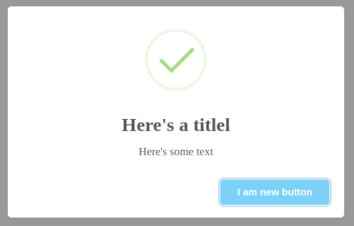
Example 2:
<!DOCTYPE html>
<html>
<head>
  <title>GeeksForGeeks Sweet alert</title>
  <script src=
"https://cdnjs.cloudflare.com/ajax/libs/sweetalert/2.1.0/sweetalert.min.js">
  </script>

</head>
<body>
  <script>
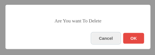
    swal("Are You want To Delete", {
      dangerMode: true,
      buttons: true,
    }    );
  </script>
</body>
</html>
Output:
List Of JSON Attribute Of Sweet Alert:
- Title: It Is used to write title inside the alert box if the title is given as a first parameter in Swal() then JSON attribute title will overwrite that target value
- Text: This Attribute Use For writing Text inside the alert box. If Swal() contains simple text outside the JSON attribute then it will overwrite those text.
- Icons: This Is Use for Displaying Icon. SweetAlert comes with 4 built-in icons that you can use: warning, error, success, info
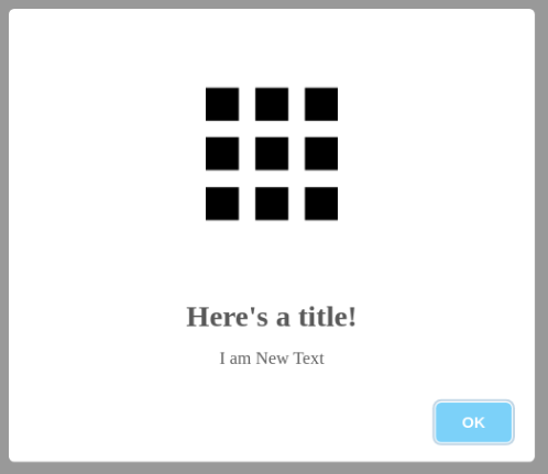
Example 3: But You Can Add Image Of icons by putting image address inside quote like:
<!DOCTYPE html>
<html>
<head>
  <title>GeeksForGeeks Sweet alert</title>
  <script src=
"https://cdnjs.cloudflare.com/ajax/libs/sweetalert/2.1.0/sweetalert.min.js">
  </script>

</head>
<body>
  <script>
  swal("Here's a title!", "Here's some text","success",{
        title:"i am New title",
        text:"I am New Text",
        icon:'https://dl.dropboxusercontent.com/s/qe98k2xvmqivxwz/google_apps.png',
  });
  </script>
</body>
</html>
Output:
- Button And Buttons: Button is used for creating a single button whereas buttons are used for creating more than 1 button. By default, buttons have two buttons "cancel" and "ok" with the default configuration.
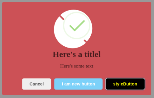
Example 4: You Can Add className attribute to both button and swal to change the style of button and dialogbox as shown in the figure below:
<!DOCTYPE html>
<html>
    <head>
        <title>GeeksForGeeks Sweet alert</title>
        <script src=
"https://cdnjs.cloudflare.com/ajax/libs/sweetalert/2.1.0/sweetalert.min.js">
        </script>
        <style>
            .buttonstyle {
                color: Yellow;
                background-color: black;
            }

            .boxstyle {
                background: rgba(256, 10, 20, 0.5);
            }
        </style>
    </head>

    <body>
        <script>
            swal("Here's a title", "Here's some text", "success", {
                className: "boxstyle",

                buttons: {
                    cancel: true,

                    New: {
                        text: "I am new button",

                        value: "new button data",

                        visible: true,
                    },

                    New2: {
                        text: " styleButton",

                        value: "new button data",

                        visible: true,

                        className: "buttonstyle",
                    },
                },
            });
        </script>
    </body>
</html>
Output:
Example 5:
<!DOCTYPE html>
<html>
    <head>
        <title>GeeksFor Geeks Sweet alert</title>
        <script src=
"https://cdnjs.cloudflare.com/ajax/libs/sweetalert/2.1.0/sweetalert.min.js">
        </script>
        <style>
            .p {
                background-color: red;
                width: 190px;
                margin: auto;
                text-align: center;
                font-size: 22px;
            }
        </style>
    </head>

    <body>
        <script>
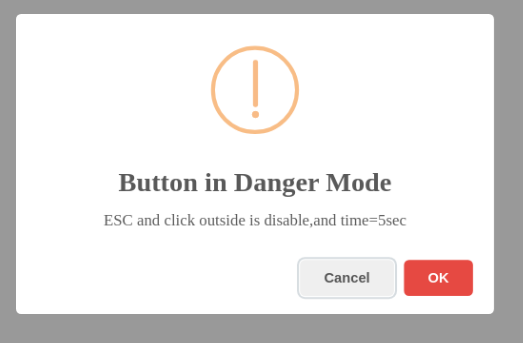
            swal("Button in Danger Mode",
                 "ESC and click outside is disable,and time=5sec",
                 "warning", {
                dangerMode: true,
                buttons: true,
                closeOnClickOutside: false,
                timer: 5000,
            });
        </script>
    </body>
</html>
Output:
- content: This is used for adding any element like P element, H1 element, Button, Textarea, Input, Div, etc. The content attribute contains Two thing element names and its attribute, Attribute means inside properties of an element like inline style, width, height, placeholder, className, etc, Following Are Example Code of Input element.
swal({
  content: {
    element: "input",
    attributes: {
      placeholder: "Enter any Number",
      // Type can be range,can be
      // password and can be text
      type: "number",
     },
  },
});
Creating Paragraph Element:
swal({
  content: {
    element: "p",
    attributes: {
     innerText:"hello",
     style:"color:blue;",
     className:"p",

    },
  },
});
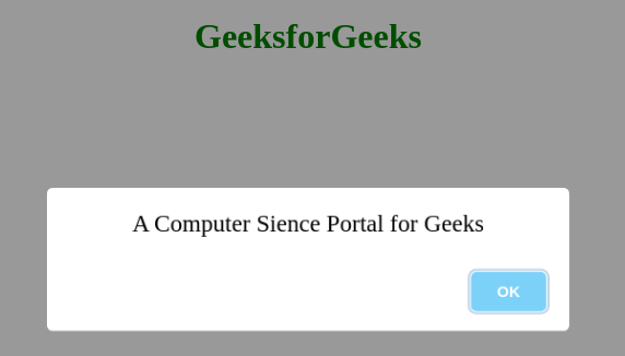
Example 6: Creating Paragraph Element.
<!DOCTYPE html>
<html>
    <head>
        <title>GeeksFor Geeks Sweet alert</title>
        <script src=
"https://cdnjs.cloudflare.com/ajax/libs/sweetalert/2.1.0/sweetalert.min.js">
        </script>
        <style>
             h1{
                 color: green;
                 text-align: center;
             }
            .p {
                width: 100%;
                margin: auto;
                text-align: center;
                font-size: 22px;
            }
        </style>
    </head>

    <body>
        <h1>GeeksforGeeks</h1>
        <script>
            swal({
                content: {
                    element: "p",
                    attributes: {
                        innerText: "A Computer Science Portal for Geeks",
                        style: "color: black;",
                        className: "p",
                    },
                },
            });
        </script>
    </body>
</html>
Output: